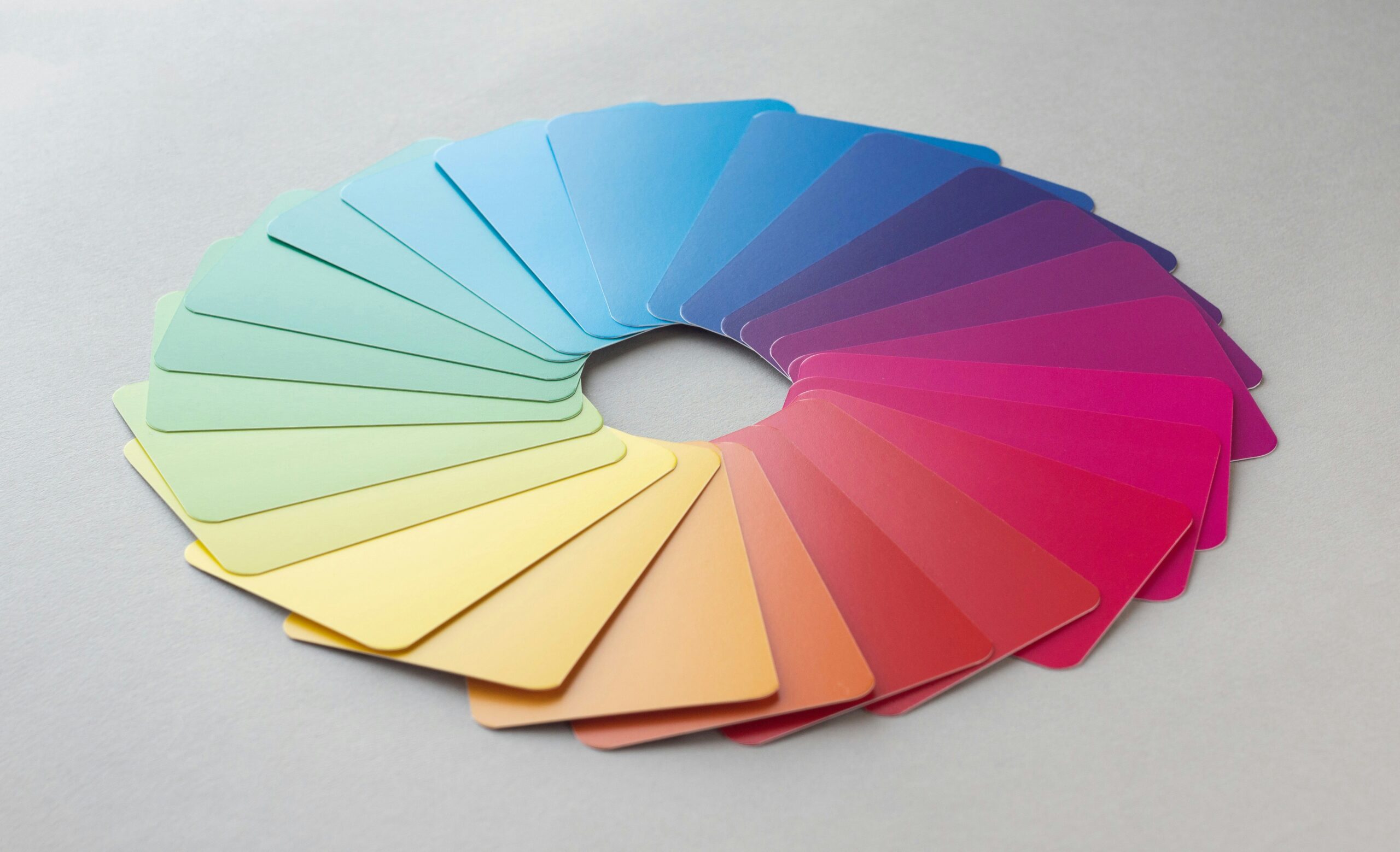
Color theory stands as one of the most fundamental yet transformative aspects of graphic and digital design. Whether you’re crafting a brand identity, designing user interfaces, or creating compelling visual narratives, your understanding of color relationships determines the emotional impact and effectiveness of your work.
This comprehensive approach to color theory education, inspired by the structured methodology of Adobe Illustrator CC Classroom in a Book by Brian Wood, offers both theoretical depth and practical application. Advanced designers and design educators will find this framework particularly valuable for mastering sophisticated color applications while building proficiency in industry-standard tools.
The methodology emphasizes hands-on, project-based learning that bridges the gap between color theory principles and real-world design challenges. Through 15-17 structured lessons, practitioners develop not only technical skills in Adobe Illustrator but also the critical thinking necessary to make informed color decisions across various design contexts.
Understanding Color’s Psychological and Cultural Impact
Color psychology extends far beyond basic emotional associations. Advanced practitioners recognize that cultural context, accessibility considerations, and brand positioning all influence effective color implementation. The color wheel serves as your starting point, but sophisticated design requires understanding how hue, saturation, value, and temperature interact within complex visual hierarchies.
Professional color application demands familiarity with harmonious relationships—complementary schemes create visual tension and energy, while analogous palettes establish cohesion and flow. Triadic combinations offer balanced vibrancy, and monochromatic approaches emphasize texture and form through value variations.
Contemporary design increasingly prioritizes accessibility alongside aesthetics. WCAG guidelines provide measurable standards for contrast ratios, ensuring your color choices remain functional across diverse user experiences. This integration of accessibility principles with color theory represents essential knowledge for modern design practice.
Mastering Adobe Illustrator’s Color Ecosystem
Adobe Illustrator’s vector-based environment offers unparalleled precision for color manipulation and consistency. The software’s color management system encompasses multiple tools—the Color panel for precise adjustments, Swatches for organizational efficiency, and the Color Guide for exploring harmonious variations.
Understanding CMYK versus RGB color spaces becomes critical when designing for both print and digital applications. Vector graphics maintain color integrity across scaling, making Illustrator ideal for logo development and brand systems where color consistency across multiple touchpoints is paramount.
Advanced techniques include gradient creation for dimensional effects, blend modes for sophisticated color interactions, and global swatches for efficient brand color management. These tools, when combined with color theory knowledge, enable designers to create visually compelling and technically sound solutions.
Advanced Color Applications in Professional Practice
Professional design work requires sophisticated color application across multiple contexts. UI design demands understanding how color affects usability and user behavior—warm colors can encourage action, while cool tones suggest reliability and professionalism. Motion graphics introduce temporal considerations, where color transitions guide viewer attention and create emotional pacing.
Brand development represents perhaps the most complex color application, requiring designers to balance aesthetic preferences with market positioning, cultural sensitivity, and practical implementation across diverse media. Successful brand colors function effectively in digital interfaces, print materials, environmental graphics, and packaging applications.
Pattern creation and color effects expand creative possibilities while demanding careful attention to color relationships within repetitive structures. Transparency and blending modes offer sophisticated methods for creating visual depth and interest without compromising legibility or brand consistency.
Building Professional Color Expertise
Portfolio development should showcase color expertise across diverse project types—logos demonstrating systematic color application, UI designs highlighting accessibility considerations, and motion graphics showing temporal color relationships. Each project should demonstrate not only aesthetic sensibility but also strategic color thinking.
Client communication around color choices requires both technical knowledge and presentation skills. Successful designers articulate the reasoning behind color decisions, connecting aesthetic choices to business objectives and user experience goals. This capability distinguishes professional practitioners from those with purely technical skills.
Continuous learning in color theory encompasses staying current with annual color trends, exploring emerging applications in digital media, and engaging with design communities where color applications are critiqued and refined. Resources like Adobe Color, Pantone forecasting, and design blogs provide ongoing inspiration and technical updates.
Integrating Color Across Design Workflows
Modern design practice increasingly requires color consistency across multiple Adobe Creative Suite applications. Maintaining color accuracy when moving between Illustrator, Photoshop, and XD demands understanding each application’s color management capabilities and limitations.
Export considerations for color-accurate assets involve technical knowledge of color profiles, file formats, and output specifications. Professional work requires delivering assets that maintain color integrity across print production, web deployment, and mobile applications—each with distinct technical requirements.
Collaborative workflows benefit from systematic color organization through shared libraries, documented color specifications, and clear naming conventions. These organizational systems become particularly important in team environments where multiple designers must maintain visual consistency.
Download the Color Theory Mastery Book
Expanding Your Color Theory Foundation
This structured approach to color theory education provides the foundation for advanced design practice. The combination of theoretical understanding and practical application through Adobe Illustrator creates a comprehensive learning experience that addresses both creative and technical aspects of professional design work.
The methodology’s emphasis on real-world projects ensures that theoretical knowledge translates into practical skills. From initial color wheel exercises to comprehensive brand identity projects, each lesson builds toward professional competency while maintaining focus on color theory principles.
For design educators and advanced practitioners seeking systematic color theory instruction, this framework offers a proven structure that balances conceptual depth with hands-on application, creating the foundation for sophisticated design practice.
